

There’s a common misconception that calming spaces have to be neutral, pale, or stripped of personality however, serenity doesn’t have to mean boring. In fact, some of the most peaceful rooms still include color, contrast, and visual energy. The key? Intentionality.
Rather than relying solely on traditional color psychology; blue equals calm, red equals striking, start by asking: How do certain colors make me feel? The emotional response to color is deeply personal. For some, a dusty mauve might feel grounding. For others, a deep forest green evokes quiet luxury.
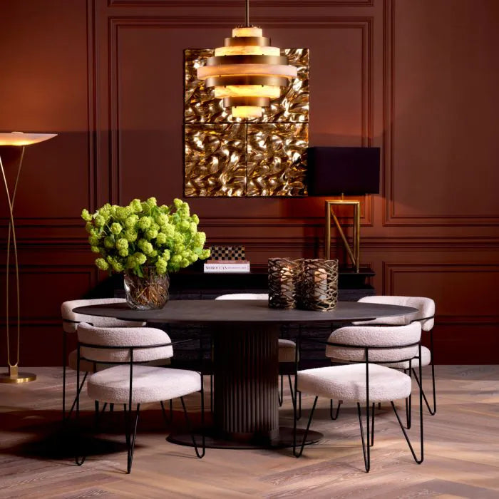
Even vibrant tones can feel soothing when paired with tactile materials, balanced lighting, and thoughtful proportions. Color doesn’t need to be loud to be expressive and calm doesn’t have to be beige.


